https://spoonuniversity.com/lifestyle/oreo-cookies-design-truth
The Dark Truth Behind the Design on Oreo Cookies
You’ll never see these cookies in the same way ever again.
 Nadya Korytnikova
Boston University
facebooktwitterpinterest
An average of 3 billion consumers buy Oreo packages each year, making Oreo the top-selling cookie of the 20th century. But have any of those billions of people ever noticed that they licked off the creamy white filling from the Knight Templar symbol, dipped the Cross Pattee sign into the glass of milk, or satisfied their hunger with the Nabisco logo? Life is just full of surprises.
Here's everything you need to know about the logo on your favorite Oreo cookie.
Cross of Lorraine

Photo courtesy of flickr.com
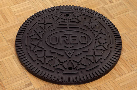
A circle topped with a two-bar cross is a Nabisco logo that stands for a European symbol of quality. Experts believe the design for the Nabisco symbol arose from the Cross of Lorraine, which was carried by the Knights Templar during the First Crusade in the 11th century. These knights, along with many other Christian pilgrims, went to Jerusalem, the capital of Israel, to recapture it from the Turks who were peacefully living there, whom the Knights mercilessly slaughtered upon their arrival to the city. Dark, dark, history; just like Oreo.
Cross Pattée

Photo courtesy of flickr.com
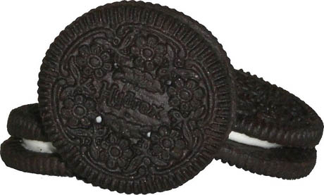
The geometric pattern of a dot with four triangles radiating outward is a symbol that once again connects Oreos with the history of the First Crusade. It closely resembles a Cross Pattee, a symbol the Knights Temples adopted by sewing the red or black crosses on their white robes and other pieces of clothing to distinguish themselves from soldiers of other religion.
But while some people do recognize this ancient emblem, most consumers see it as a four-leaf clover, with each leaf emphasizing hope, faith, love, and luck. No wonder why the Oreo company has so much luck selling more than 95 million packages each day.
Shape

Photo courtesy of flickr.com
The circle has many mystical meanings including a circle of life, creation, infinity, power, love, and most importantly, change. So, Oreo is not just a tasty round cookie; it is also a friendly reminder that the power of changing your life is all in your hands.
Why "Oreo?"

Photo courtesy of flickr.com
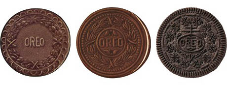
The origin of the name remains a mystery. Some believe that the cookie’s name came from the French word “gold” (doré) because that was the color of the original Oreo package. Others claim that the name is a combination of taking “re” from “cream” and placing it between the two “o”s in “chocolate,” making “o-re-o.”
You can ponder how the Oreo got its catchy name for a very long time, but it’s much better just to grab a whole package of these delicious cookies, take a cup of warm milk, and enjoy a late night snack you deserve. Enjoy.
The Dark Truth Behind the Design on Oreo Cookies
You’ll never see these cookies in the same way ever again.

Boston University
facebooktwitterpinterest

An average of 3 billion consumers buy Oreo packages each year, making Oreo the top-selling cookie of the 20th century. But have any of those billions of people ever noticed that they licked off the creamy white filling from the Knight Templar symbol, dipped the Cross Pattee sign into the glass of milk, or satisfied their hunger with the Nabisco logo? Life is just full of surprises.
Here's everything you need to know about the logo on your favorite Oreo cookie.
Cross of Lorraine

Photo courtesy of flickr.com
A circle topped with a two-bar cross is a Nabisco logo that stands for a European symbol of quality. Experts believe the design for the Nabisco symbol arose from the Cross of Lorraine, which was carried by the Knights Templar during the First Crusade in the 11th century. These knights, along with many other Christian pilgrims, went to Jerusalem, the capital of Israel, to recapture it from the Turks who were peacefully living there, whom the Knights mercilessly slaughtered upon their arrival to the city. Dark, dark, history; just like Oreo.
Cross Pattée

Photo courtesy of flickr.com
The geometric pattern of a dot with four triangles radiating outward is a symbol that once again connects Oreos with the history of the First Crusade. It closely resembles a Cross Pattee, a symbol the Knights Temples adopted by sewing the red or black crosses on their white robes and other pieces of clothing to distinguish themselves from soldiers of other religion.
But while some people do recognize this ancient emblem, most consumers see it as a four-leaf clover, with each leaf emphasizing hope, faith, love, and luck. No wonder why the Oreo company has so much luck selling more than 95 million packages each day.
Shape

Photo courtesy of flickr.com
The circle has many mystical meanings including a circle of life, creation, infinity, power, love, and most importantly, change. So, Oreo is not just a tasty round cookie; it is also a friendly reminder that the power of changing your life is all in your hands.
Why "Oreo?"

Photo courtesy of flickr.com
The origin of the name remains a mystery. Some believe that the cookie’s name came from the French word “gold” (doré) because that was the color of the original Oreo package. Others claim that the name is a combination of taking “re” from “cream” and placing it between the two “o”s in “chocolate,” making “o-re-o.”
You can ponder how the Oreo got its catchy name for a very long time, but it’s much better just to grab a whole package of these delicious cookies, take a cup of warm milk, and enjoy a late night snack you deserve. Enjoy.


