Symbolism in Former Logos of American & United Airlines

Riptide

Established
Joined
Mar 30, 2020
Messages
276
Been wanting to share this for a while. Haven't seen anyone mention this on the internet before. As we know United and American were the two airlines involved in the 9/11 plane hijackings. Their logos are different today, but during the '70s thru '00s they both contained ambiguous imagery which merges their company's initials and symbols with the twin towers. Its especially noticeable when you convert the colors to grayscale.


2001 to Grayscale.png

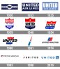
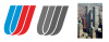
Below are the extended logo histories of both UA and AA. Its very interesting that American Airlines chose to make the wings of its eagle more rigid to resemble two long, vertical rectangles - in 1967, the year before construction began on the Twin Towers.

And United Airlines chose to go for its double-U design in 1974, the year after the Twin Towers were completed.


IMG_4915.JPG

IMG_4916.JPG

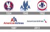
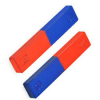
AA and UA both use the colors red and blue in their logos. Aside from their significance in the US flag, it might be worth noting that red and blue traditionally represent north and south on a magnet. (As in the North and South towers)

magnet.png

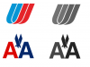
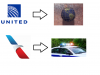
Fast-forward to today and see the active logos of these companies. For United, you've got a gridded globe and for American, you've got a singular red, white and blue stripe. These logos could signify an approaching global police state.


Present Day.png

u accenuated.png

Thanks for reading.
 
Last edited:

~JC~

Veteran
Joined
May 21, 2017
Messages
922
That 1974 United Airlines symbol seems like a very BIZARRE choice and I wonder what the reason was behind that design. The symbol is just not obvious or intuitive for UA...
 

Journeyman

Established
Joined
Nov 24, 2020
Messages
381
Interesting!

You can see the same progression from two to one, duality to unity in the logos as in the move from WTC 1&2 to One World Trade Centre. Looking back, I think we can also see the same Phoenix pretending to be an Eagle from the Great Seal holding the earth in its claws in in the earlier AA logos. 1934 looks to have the fallen angel lightning bolt also?

Very reminiscent of some of the USAF badges, see NORAD and US Marines also?

That 1974 United Airlines symbol seems like a very BIZARRE choice and I wonder what the reason was behind that design. The symbol is just not obvious or intuitive for UA...
I wonder if there's an inversion or mirroring that would reveal a hidden meaning?

As to the background to 9/11. Check this out: https://christianobserver.net/the-shekhina/#wrap

Was 9/11 a ritual to usher in the new age by signifying the re-uniting of the Shekinah with Kether? Thus an end to dualism and the achievement of the alchemical goal of uniting the opposites? Maybe the ruling school of androgynous masonry consider it an essential element in their path to ascension.

Asterath is another name for Ishtar who I believe looked across to the Twin Towers in her guise of 'Lady Liberty' courtesy of the French Freemasons. I think the plans for this have been a long, long time in the making...
 
Last edited:

Journeyman

Established
Joined
Nov 24, 2020
Messages
381
That 1974 United Airlines symbol seems like a very BIZARRE choice and I wonder what the reason was behind that design. The symbol is just not obvious or intuitive for UA...
Further thought on this, could it be a reference to the Hebrew/Phonecian 'Shin'


If you look at the first drawing of it in the link above you can perhaps see it within the US logo?

"In the Sefer Yetzirah the letter Shin is King over Fire, Formed Heaven in the Universe, Hot in the Year, and the Head in the Soul."

You may also find this interesting from KijaniAmariAK he links shin/sinn to Vulcan and the serpent - it's timestamped for the Shin reference:
 

Journeyman

Established
Joined
Nov 24, 2020
Messages
381
Good spot.

The positioning of the beams reminds me of the two fingered Baphomet hand signal, the 'V' which I think translates to duality to unity, uniting the masculine and feminine via the alchemical wedding. The red and blue could refer to the masculine and feminine energies just as the twin towers did, with the North Tower's antenna' = masculine. The Magician wears red robes, the High Priestess Blue. Could also match to the Qabalah, Geburah (The Power) and Gedulah (The Glory) sephiroth on the Tree of Life. Could be way off of course.

I think there will be some 9/11 disclosure, in fact I think it's already begun. Not of its ritual nature, more stuff around the politics / cover up etc. Perhaps as a distraction or a way of harnessing attention? I've also recently seen Lavette Hawkins classing 9/11 as a fire ritual to go alongside Hurricane Katrina, Fukushima and possibly another one, with the object being to form a Chi Pro symbol corresponding to movements in the constellations, 'as above, so below'.

Once you start seeing the esoteric influence within logos you can't stop. Their is a vast landscape of kabbalist magic underway all around us, from the logos and signs on the streets to the buildings and the placement of bridges and other landmarks. It really is a very different world than the one we thought it was and 9/11 is perhaps just the point that they stepped out of the shadows to more blatantly announce themselves to those with eyes to see?
 
Top