They definitely made it sound more interesting.Woah..... Pentatonix cover of Butter and Dynamite.

BTS discussion thread
- Thread starter Maggieca
- Start date
Strawberrypie
Star
- Joined
- Mar 1, 2021
- Messages
- 4,701
It's not his choice, he looks miserable. They're doing it to Bg and Yj now. They look very feminine. One was in pigtails and the other wears crop tops.The issue I have with the car wash photos, at least from a commercial standpoint, is that they're guys. Not that men don't work at car washes cause they do, it's just that these sorts of photoshoots are 99% of the time exclusively of women. They're stupid and sexist photoshoots when they're of women. And having a bunch of men doing a squeaky-clean family friendly version of this concept doesn't do anything for women, it doesn't break boundaries or make me and other women feel "represented". It's just extremely dumb, unoriginal and boring.
Also, the photos of them with the hoses, and the fact that the water was so obviously photoshopped, was hilarious to me. Like, what's the point of a car wash photoshoot if they aren't going to at least get a little bit wet? Not to be inappropriate here, but let's be real, car wash photoshoots are never about washing cars.
I don't take issue with a man shaving his armpits or legs or anywhere else if he chooses to do that for no reason other than he wants to. But I highly doubt that JM, who was VERY masculine when they first debuted, suddenly in the last few years is okay with being this effeminate. I can't really explain why I think it's so obviously not his choice, it just is very obviously not his choice.
Berrywon88
Star
- Joined
- Jun 23, 2021
- Messages
- 2,594
It happened a few times on jn's weverse account where he or a staff would reply to multiple posts from the same army for that day. His fans on twtrr would cry about how lucky said army was etc. I saw some wondered how he found these posts. I was surprised no one thought that it was all fake.When did that happen? That means everything on weverse is a lie like their other stuff.
Berrywon88
Star
- Joined
- Jun 23, 2021
- Messages
- 2,594
He is severely underweight and it is sad. I actually noticed something with kpop fans recently. A lot of boy group fans coddle/baby members while refusing to hear criticism or concern for their health. To admit their fave is not looking well would be humanizing him. And they treat these idols like dolls not humans. While most girl group fans are highly critical of their faves and if they lose or gain any weight lord help them. For example, I saw this on twittr.Yeah, his weight loss is a lot and concerning.....
While his weight loss is maybe the most recent and obvious one, I also feel like with most bts members I genuinely think they look emaciated in recent times. Like the make up can sort of cover it up, but they look really, really exhausted and unhealthy if you look closely.
I think Jin, Jmn, and jk look very weak, but also hobi recently looked so exhausted.
Years of constant practice, pressure, photo shoots, interviews and all the other behind the scenes stuff and god knows what does eventually show physically.
In this recent video I was really shocked at his thin frame.
Almost all the fans immediately criticize anyone who makes an observation or comment about members weight etc, and while it is not right to make definitive conclusions, since we simply don't know what exactly goes on, I think it is perfectly normal to make an observation and maybe be worried. Saying he looks healthy, like most fans say is delusional, like he very clearly looks poorly.
To be honest, while I don't support their agendas etc., I do feel sad looking at him, because I know also from close friends what an extreme struggle eating issues/body image issues can be, they can affect your health in so many ways and it is a constant struggle.
I think blackpink look a lot more healthy now but the posts about them are vile. From the company and fans it's impossible for idols to live up to these kind of expectations.
Pepsi
Veteran
- Joined
- Jan 18, 2019
- Messages
- 777
it has exposed everything there is to be, so nothing is shocking anymore and i think that's why you feel that waythis forum isn't what is used to be :/
Pepsi
Veteran
- Joined
- Jan 18, 2019
- Messages
- 777
not a politician but some hotshot at Gucci if I'm not wrongapart the outfit, the guy with him is a politician ? don't know but it could be he was passed around to those elite men
Pepsi
Veteran
- Joined
- Jan 18, 2019
- Messages
- 777
this is very true lolNo older members on here ever posts so that makes sense, right? I see some cry on here about this thread changing but offer zero contributions. Also, as a new member I went through a lot of this thread and most of the time I had to skip several pages because there were members fighting, random people derailing the thread on purpose, and extremist religious posts...none of these having anything to do with b*s. I find the newer members posting now are more chill and actually discuss b*s.
Strawberrypie
Star
- Joined
- Mar 1, 2021
- Messages
- 4,701
They don't have time for weverse when there's commercials, online concerts, lives, announcements and releases. It's unfair to the fans who think it's real.It happened a few times on jn's weverse account where he or a staff would reply to multiple posts from the same army for that day. His fans on twtrr would cry about how lucky said army was etc. I saw some wondered how he found these posts. I was surprised no one thought that it was all fake.
Their arms look so small. If they're doing this to the younger ones what did they do to btees? I think YJ's lip implants aren't for aesthetics. Jm and Jn have them too. Why do men get lip fillers and bbls. There's a lot of rumors that Jm got one done.
yes politician or not, he must be someone from the Elite toonot a politician but some hotshot at Gucci if I'm not wrong
ok thanks didn't know himThat's M@rco Bizz@rri the CEO of G#cci.
Luisy
Established
- Joined
- May 16, 2021
- Messages
- 181
Its not just jin account, everyone. All are staff.It happened a few times on jn's weverse account where he or a staff would reply to multiple posts from the same army for that day. His fans on twtrr would cry about how lucky said army was etc. I saw some wondered how he found these posts. I was surprised no one thought that it was all fake.
Yeah this is one of the posts from jul 20 2020 where V aka staffs save post 5 am in the morning, only to reply kekeke later on.

a
about J-hope, yesterday i was watching for the first time the Chicken Noodles Soup video with Becky G, she looks more fine and healthy than him in the video , he looks really skinny ..Yeah, his weight loss is a lot and concerning.....
While his weight loss is maybe the most recent and obvious one, I also feel like with most bts members I genuinely think they look emaciated in recent times. Like the make up can sort of cover it up, but they look really, really exhausted and unhealthy if you look closely.
I think Jin, Jmn, and jk look very weak, but also hobi recently looked so exhausted.
Years of constant practice, pressure, photo shoots, interviews and all the other behind the scenes stuff and god knows what does eventually show physically.
In this recent video I was really shocked at his thin frame.
Almost all the fans immediately criticize anyone who makes an observation or comment about members weight etc, and while it is not right to make definitive conclusions, since we simply don't know what exactly goes on, I think it is perfectly normal to make an observation and maybe be worried. Saying he looks healthy, like most fans say is delusional, like he very clearly looks poorly.
To be honest, while I don't support their agendas etc., I do feel sad looking at him, because I know also from close friends what an extreme struggle eating issues/body image issues can be, they can affect your health in so many ways and it is a constant struggle.
Last edited:
Luisy
Established
- Joined
- May 16, 2021
- Messages
- 181
Noone got any answer about it? Why anyone from bts or staffs would be using a browser? All of them should have weverse app right?Yes.
What does this description mean "Uploaded from web browser"? Was it uploaded from a browser but not the app? Why they would be using a browser on that day?
View attachment 61010
I think the samsungs bts use are just to show up and advertise and only for bts idol work. Those are the phones they share with staffs, not the actual personal phone with personal information. probably bts use iphone. The staffs, especially the female ones, look like obsessed fans; some of them have bts stickers behind their mirrors.
If really TH posted this video, it means that phone doesn't have any weverse app - so he used a browser. Staffs pretending to be bts shows bts themselves don't need any weverse.
Or, for some reason staffs used another phone on that day which doesn't have any weverse app.
Berrywon88
Star
- Joined
- Jun 23, 2021
- Messages
- 2,594
Wow, I thought jn's lips were natural since he had full lips even as a child.They don't have time for weverse when there's commercials, online concerts, lives, announcements and releases. It's unfair to the fans who think it's real.
Their arms look so small. If they're doing this to the younger ones what did they do to btees? I think YJ's lip implants aren't for aesthetics. Jm and Jn have them too. Why do men get lip fillers and bbls. There's a lot of rumors that Jm got one done.
i think he done something to his lipsWow, I thought jn's lips were natural since he had full lips even as a child.
Shuna
Star
- Joined
- Apr 6, 2018
- Messages
- 1,369
Le réseau australien a accidentellement diffusé des images d’un rituel satanique dans un segment d’information (insider.com)sorry not kpop related but guys look at this
this is why i stopped watching the news
Berrywon88
Star
- Joined
- Jun 23, 2021
- Messages
- 2,594
Yeah I think it's pretty much confirmed that they don't use Samsung for real they just have to be seen with it. T*e blocked out what is probably his iPhone in this pic.Noone got any answer about it? Why anyone from bts or staffs would be using a browser? All of them should have weverse app right?
I think the samsungs bts use are just to show up and advertise and only for bts idol work. Those are the phones they share with staffs, not the actual personal phone with personal information. probably bts use iphone. The staffs, especially the female ones, look like obsessed fans; some of them have bts stickers behind their mirrors.
If really TH posted this video, it means that phone doesn't have any weverse app - so he used a browser. Staffs pretending to be bts shows bts themselves don't need any weverse.
Or, for some reason staffs used another phone on that day which doesn't have any weverse app.
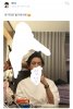
And the female staffs that do the make up etc always bugged me...the company shows them on camera supposedly doing the groups makeup but they do absolutely nothing...always with those little brushes with no product on them lol and it comes across as these women just wanting to touch the members faces or something. It's weird!

The real makeup work must be done off camera.
Like there's no strands of hair out of place here. what is she doing? hahaha...
Luisy
Established
- Joined
- May 16, 2021
- Messages
- 181
Female staffs always unnecessarily touching them every now and then. Im surprised armys never think its inappropiate.Yeah I think it's pretty much confirmed that they don't use Samsung for real they just have to be seen with it. T*e blocked out what is probably his iPhone in this pic.View attachment 61051
And the female staffs that do the make up etc always bugged me...the company shows them on camera supposedly doing the groups makeup but they do absolutely nothing...always with those little brushes with no product on them lol and it comes across as these women just wanting to touch the members faces or something. It's weird!
View attachment 61053
The real makeup work must be done off camera.
Like there's no strands of hair out of place here. what is she doing? hahaha...
I have been watching weverse for few hours today and witnessed suddenly armys are flooding weverse with the message "thank you taehyung for coming weverse so often" with same copy paste letters and many of those profiles have been active after a long time only to post these sort of letters. Definitely many users on bts weverse app are bots, I don't trust that wever number they have on top. Staffs definitely keep up with this thread its no coincidence suddenly they are trying to clarify its actually TH himself who comes on weverse. Haha poor b**tards!
Last edited:
j1m1n got a bbl?They don't have time for weverse when there's commercials, online concerts, lives, announcements and releases. It's unfair to the fans who think it's real.
Their arms look so small. If they're doing this to the younger ones what did they do to btees? I think YJ's lip implants aren't for aesthetics. Jm and Jn have them too. Why do men get lip fillers and bbls. There's a lot of rumors that Jm got one done.
Laura755y
Star
- Joined
- Aug 10, 2021
- Messages
- 2,568
Well,
-There's a rumor that Bts's make up artists are gay male and most of the femal, are there to help, thats why in the first pic of tae the one behind him is a male and the femal is just giving him the brush, also a guy who worked with em in america 4 years ago, said that some of their makeup artists are gay but the compagny isnt gonna reveal it, becuz of how sk is reserved toward the lgbt community nd also becuz of kfans, that's why they said that all the femal staffs are married which is 100% lies; some staffs are very young.Yeah I think it's pretty much confirmed that they don't use Samsung for real they just have to be seen with it. T*e blocked out what is probably his iPhone in this pic.View attachment 61051
And the female staffs that do the make up etc always bugged me...the company shows them on camera supposedly doing the groups makeup but they do absolutely nothing...always with those little brushes with no product on them lol and it comes across as these women just wanting to touch the members faces or something. It's weird!
View attachment 61053
The real makeup work must be done off camera.
Like there's no strands of hair out of place here. what is she doing? hahaha...
Last edited: